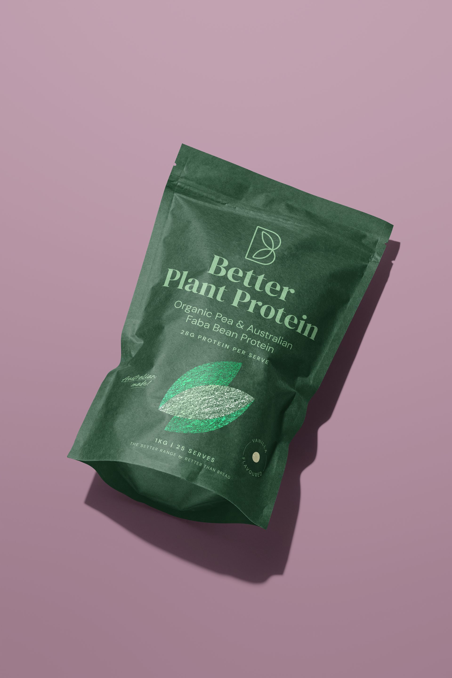
packaging.
BETTER THAN BREAD.
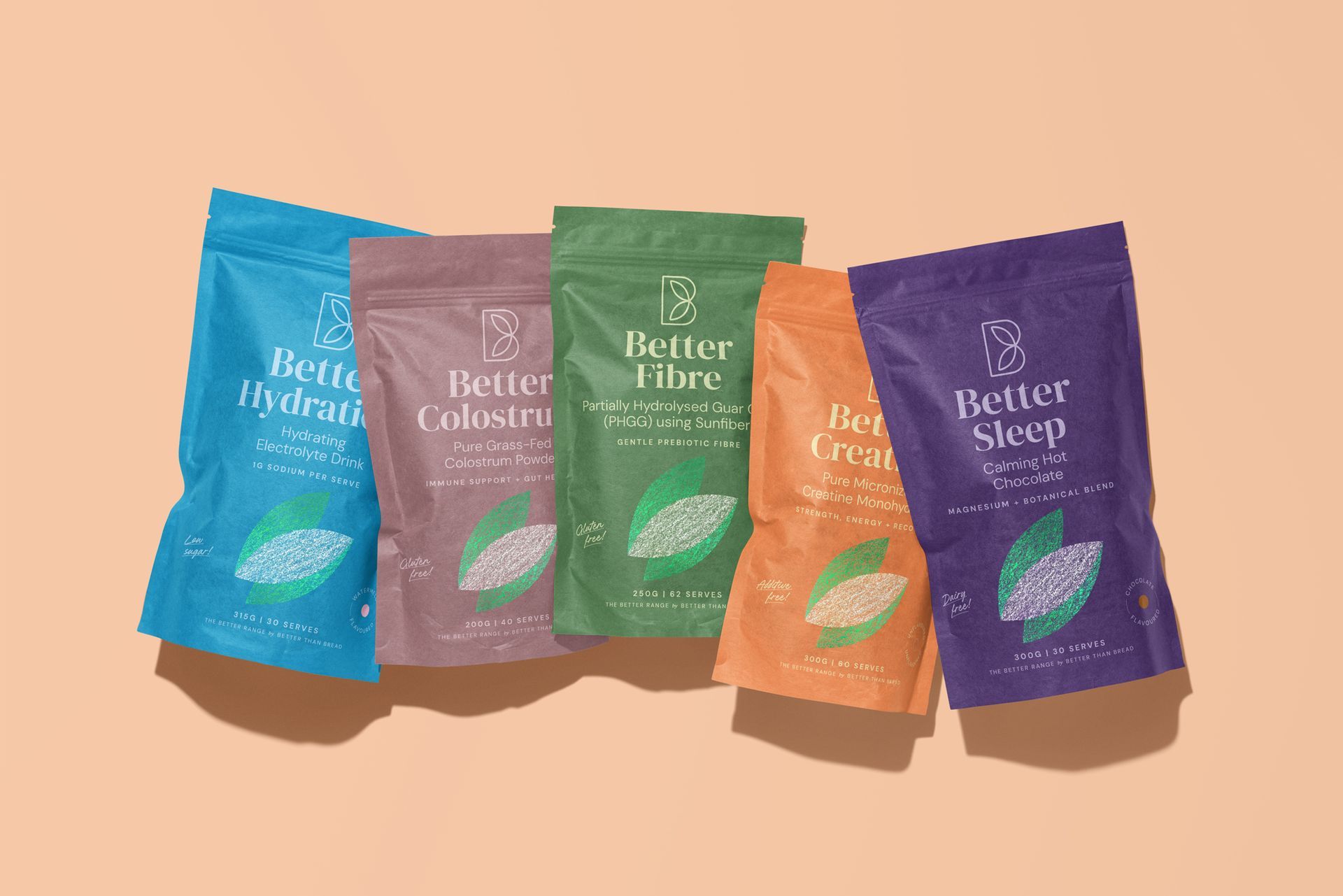
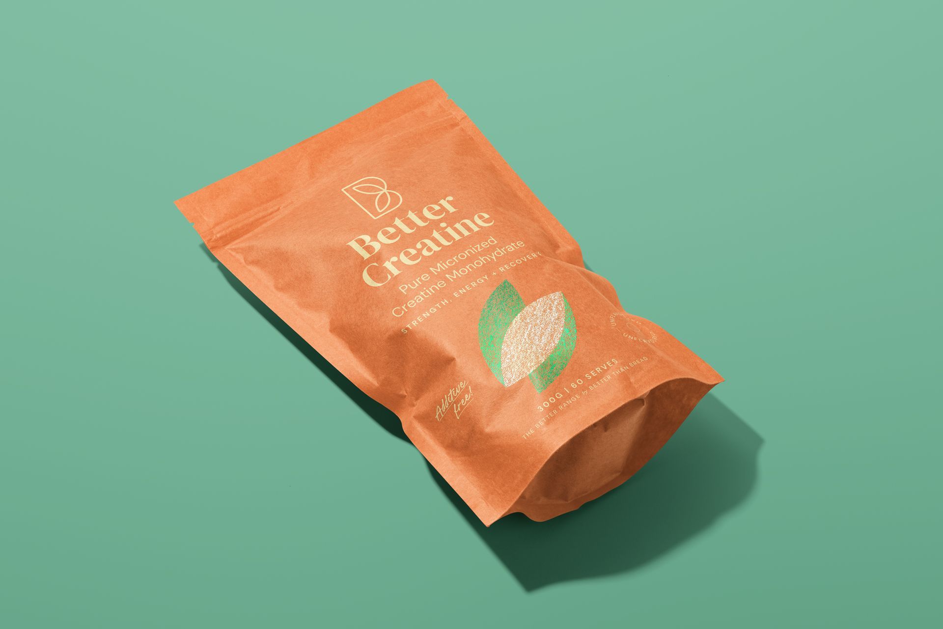
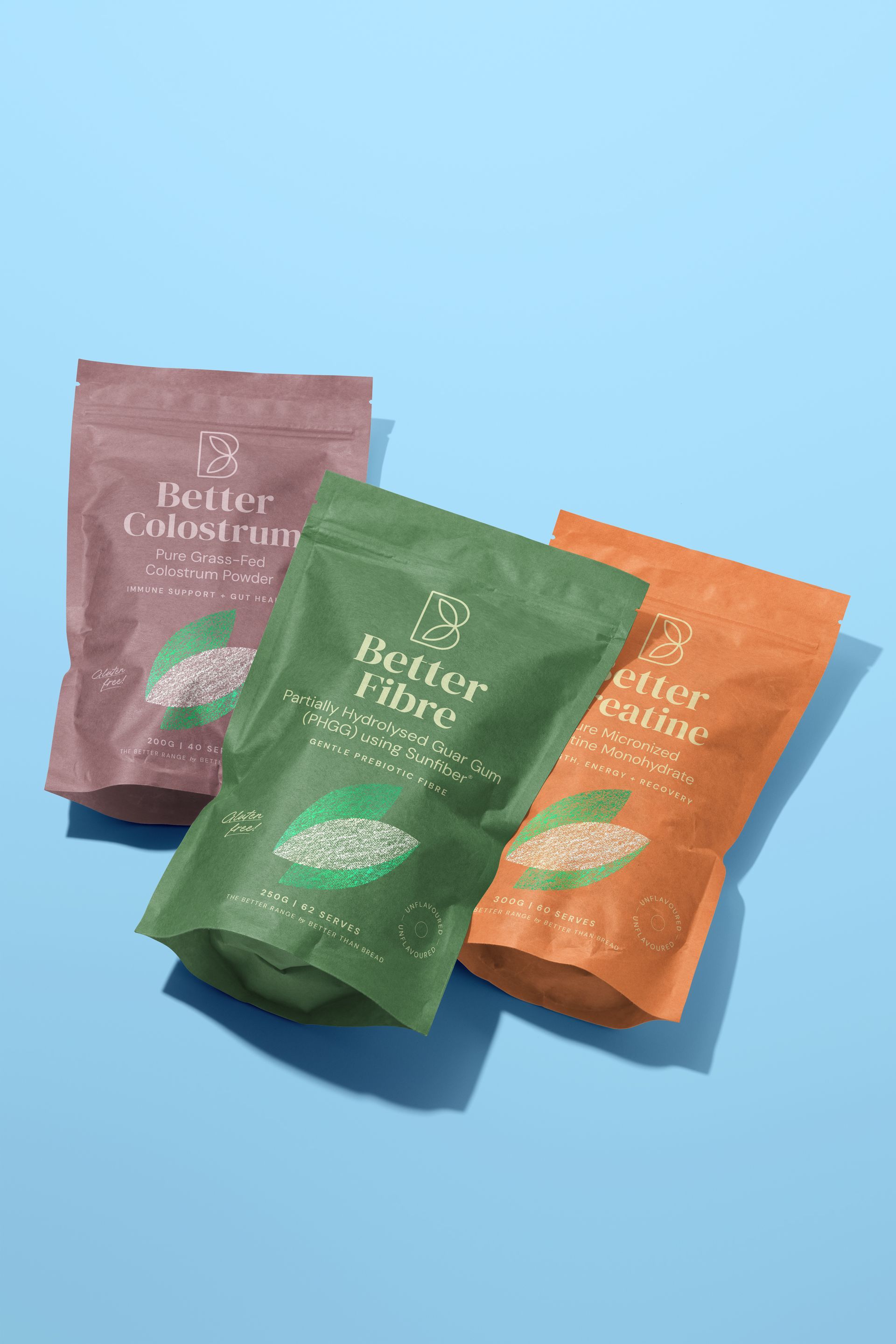
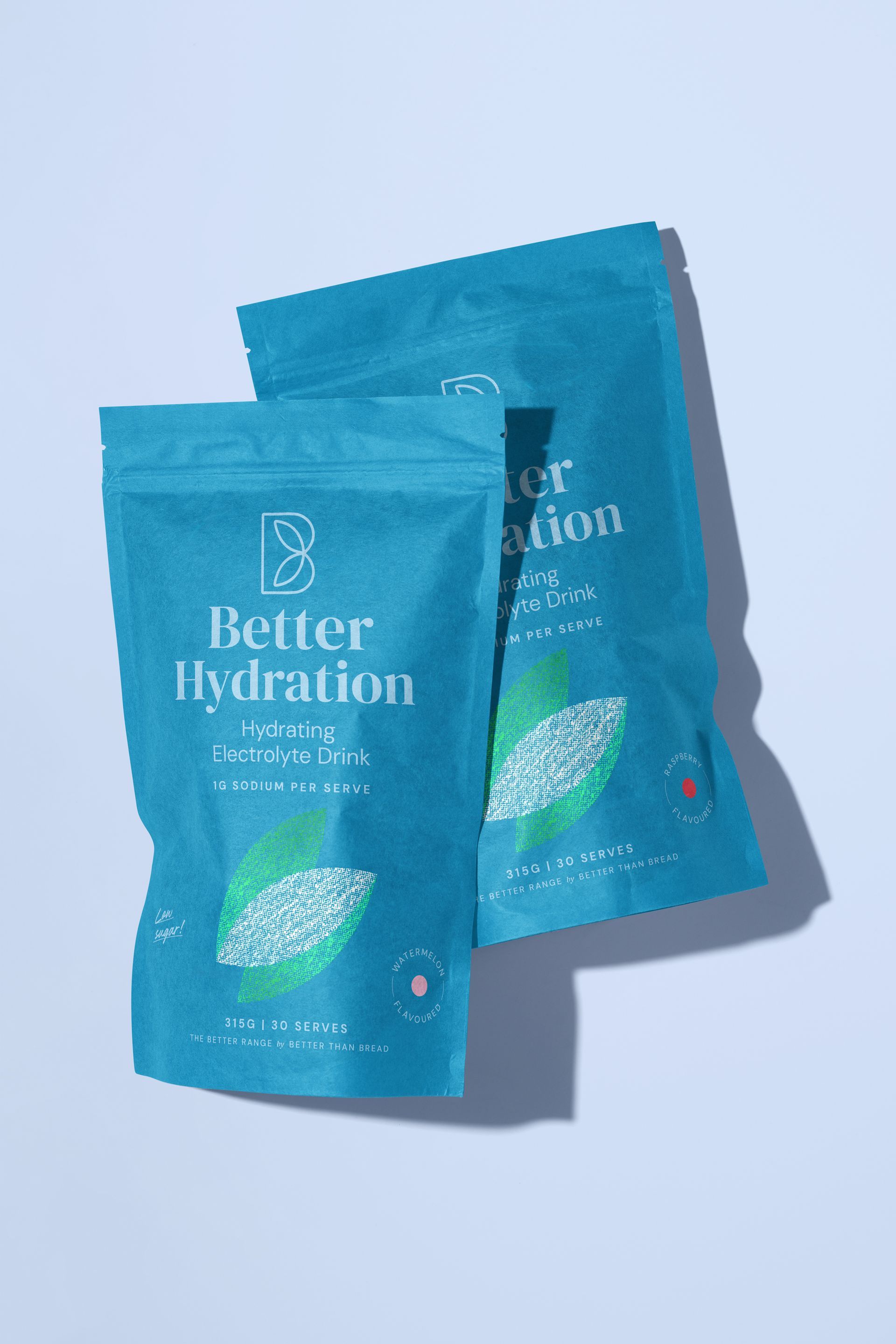
GAZE Creative had the pleasure of reimagining the packaging suite for wellness brand Better Than Bread, creating a fresh new direction that better reflects their holistic approach to health and wellbeing. Moving away from the original clinical aesthetic, we explored a warmer, more expressive visual identity through a refined colour palette, considered typography and a custom brand motif inspired by the leaves in their existing logo. Symbolising movement, vitality and growth, the motif brings a sense of life and energy to the range, while a distinct colour for each product creates individuality and improved customer shopping experience, without losing brand consistency.